The Brief
The BBC invited artists, designers and illustrators from the UK to show their love for the iconic show by creating a one-of-a-kind static poster artwork for Peaky Blinders inspired by its main characters, that displayed the strain of leadership beginning to wear away at Tommy’s seemingly unbreakable character.The Process
Entries from our designers
Two of our awesome designers Steve and Nick submitted their designs into the contest. You can see their designs below:Steve's entry:
I decided to make my entry really simple and in-keeping with the theme of the show.
I recently read in an interview by Cillian Murphy, who plays the main lead Tommy Shelby in the show, that he smoked over 1,000 cigarettes in one series of Peaky Blinders and so I made the iconic image of him smoking while wearing his famous cap but created a number five from the cigarette smoke to promote series five of the BBC drama.
To give it the Peaky Blinders feel, I desaturated the image, added some supporting smoke and a lot of grain to the final image.

Nick's entries:
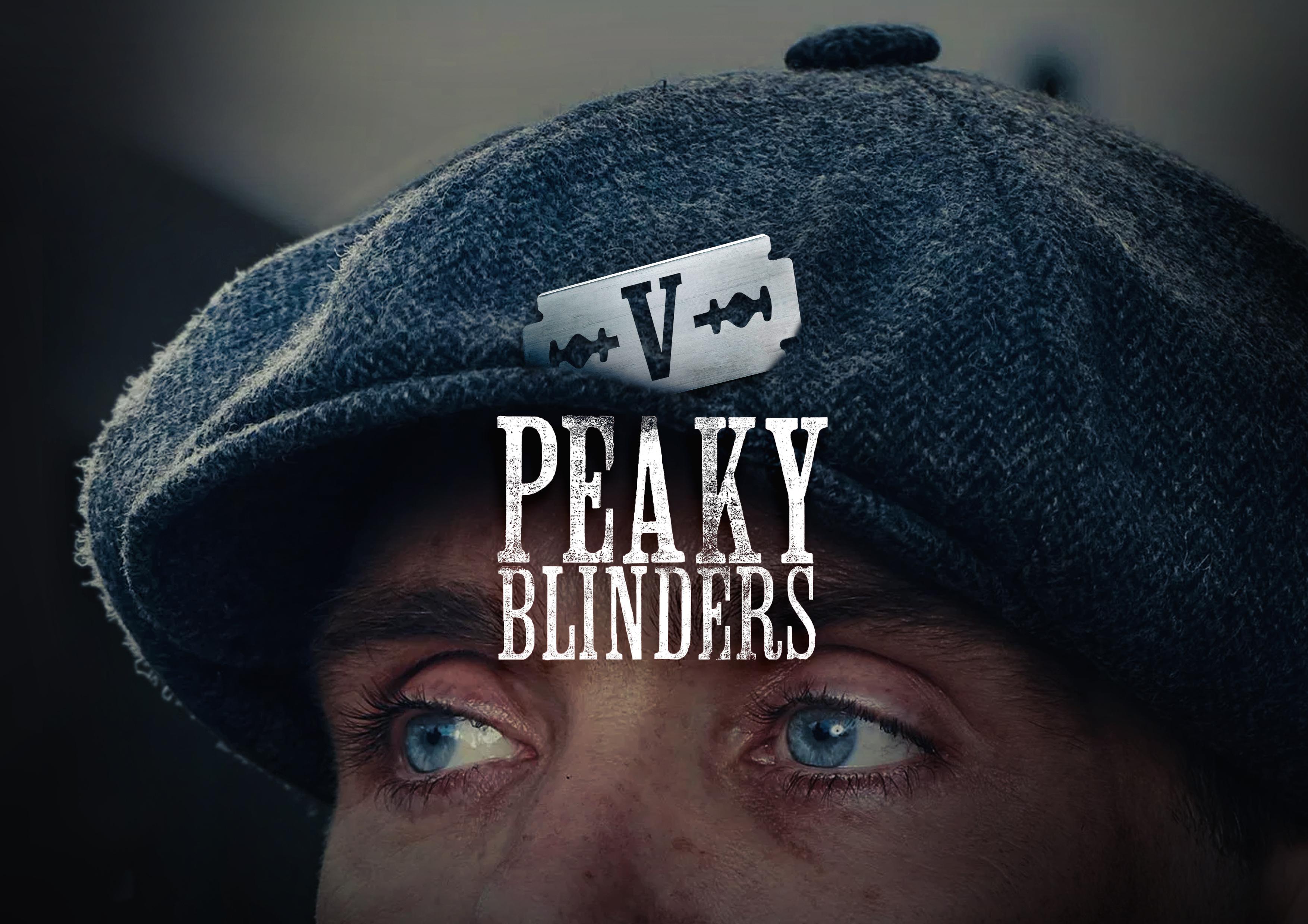
Razor V
The hat and razor blade are iconic for Peaky Blinders so I wanted them to be the main feature of my poster design. The razor blade features the number 5 in Roman numerals. I went for a dark, moody, desaturated tones which reflects the show perfectly.

Peaky Blinders SurVive
The typography can be read in multiple ways.
1 - Peaky Blinders 5.
2 - Peaky Blinders Survive.
By making the rest of the letters of 'survive' a keyline style, gives central focus to the logo and 5 (as Roman numeral) The image features 3 characters that have survived so far...


